How to Create Efficient Navigation Menus in Power BI and Tableau: Tips and Tricks

Let’s talk about something we all care about: making dashboards easy to navigate. Whether you’re building a simple sales overview or a detailed KPI tracker, good navigation can make or break the user experience. After all, what’s the point of a beautifully designed dashboard if users can’t figure out where to click next?
Now, here’s where it gets personal. I come from a Tableau background, so I’ve spent years crafting dashboards with Tableau’s minimalist but highly customizable approach. Recently, though, I’ve been diving into Power BI. My learning journey began a few months ago when I took on a project that involved translating a dashboard from Tableau to Power BI. This was a real eye-opener. I saw firsthand how the two tools approach navigation differently, and I discovered that each has its strengths—and quirks.
In this article, I’m not just here to share the theory; I’m here to walk you through the practical side of things. Think of it as me, a Tableau pro learning Power BI, sharing notes with a fellow BI specialist. We’ll explore how to create navigation menus in both tools, compare their features, and talk about when to use what. Let’s get started!
Creating Navigation Menus in Power BI
Power BI makes creating navigation menus a breeze, thanks to its Page Navigator. This feature is like having a GPS that’s already mapped out your route—dynamic, automatic, and easy to set up. Let’s break it down step by step:
Step 1: Setting Up Your Report Pages
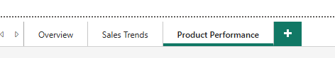
Before diving into the navigation, make sure your report pages are well-organized. Think of them as destinations on your map. Each page should represent a logical section of your report, like “Overview,” “Sales Trends,” or “Product Performance.” Keeping the structure clear will make navigation more intuitive for your users.
Step 2: Adding the Page Navigator
Here’s where the magic happens. Power BI’s Page Navigator is a built-in feature that generates a dynamic menu for your report pages:
Go to the Insert tab in Power BI Desktop.
Click Buttons > Navigator > Page Navigator.
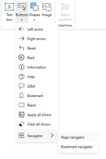
Illustration for How to Create Efficient Navigation Menus in Power BI and Tableau: Tips and Tricks Boom! Your navigation bar is automatically created, with buttons for each page in your report.
The best part? If you add or remove pages later, the Page Navigator updates itself—no manual tweaking needed.
Step 4: Enhancing the User Experience
Here are some tips to make your navigation even better:
Hide Irrelevant Pages: Use the Selection Pane to hide pages you don’t want users to see, like drafts or helper pages.
Use Meaningful Names: Rename your pages with clear, descriptive titles. Avoid generic names like “Page 1” or “Sheet 2.”
Combine with Filters: For advanced use cases, pair your Page Navigator with slicers or filters to create a more interactive experience.
Power BI’s Page Navigator is all about simplicity and efficiency. It’s perfect for when you want to focus on content rather than fiddling with the mechanics of navigation. In the next chapter, we’ll shift gears and explore how Tableau approaches navigation—spoiler alert: it’s a little more manual but just as powerful.
Creating Navigation Menus in Tableau
Tableau’s approach to navigation feels like working with a trusty compass. It’s simple, flexible, and gives you full control—but it requires a bit more effort to set up compared to Power BI. Let’s walk through how to build a navigation system in Tableau, step by step.
Step 1: Planning Your Dashboard Layout
Before creating a navigation menu, think about your dashboard’s structure. Each sheet or dashboard acts as a stop on your journey, so the layout should flow naturally. For example:
Dashboard 1: Overview.
Dashboard 2: Regional Sales.
Dashboard 3: Product Trends.
The clearer your structure, the easier it will be to guide users through the data story.
Step 2: Adding Buttons to Simulate a Menu
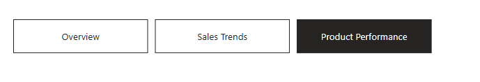
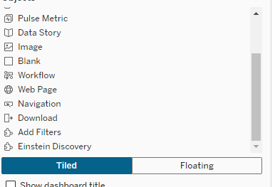
In Tableau, there’s no built-in Page Navigator like in Power BI. Instead, you create a menu by adding ready navigation buttons in containers:
Open your dashboard and drag a Container to your canvas.
Drag Navigation buttons into containers and distribute them evenly.
Step 3: Settings of navigational buttons.
Unfortunatelly you have to set up each button separately.
Navigate to: Allows you to choose link destination
Button Style: Give choice between text and image button.
Formatting: You have ability to set font, border and background, what is extremely useful when you want to mimic PowerBI Navigator behaviour, of highlighting on which element you are currently.
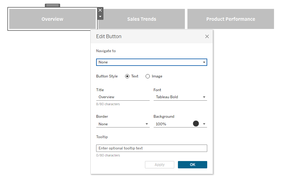
Illustration for How to Create Efficient Navigation Menus in Power BI and Tableau: Tips and Tricks
Step 5: Testing and Iterating
As with any Tableau dashboard, testing is essential. Navigate through your menus as if you’re a user. Ensure everything flows logically, and adjust button placement or actions if needed.
Tableau’s manual approach to navigation might take more time, but it offers unmatched control and customization. In the next chapter, we’ll directly compare Tableau’s compass-like navigation to Power BI’s GPS-style Page Navigator, helping you decide which fits your needs better.
Conclusion
As someone who has spent years working with Tableau and only recently started exploring Power BI, I’ve often found myself frustrated by how overcomplicated some things feel in Power BI compared to Tableau. Tableau’s simplicity and intuitive design make it my tool of choice for many projects. However, I have to give credit where it’s due: Power BI’s Page Navigator is a feature I truly admire.
The dynamic and automated nature of Page Navigator is a game-changer, especially for large or frequently updated reports. It removes the manual overhead, ensures consistency, and adds a layer of polish to navigation that’s hard to replicate in Tableau. If Tableau had a similar built-in feature, it would be a perfect blend of flexibility and efficiency.
That said, Tableau’s manual approach still has its strengths, offering complete control and allowing for highly customized navigation systems. But it’s hard not to feel envious of Power BI users when setting up a navigation bar for a complex dashboard.
At the end of the day, both tools have their strengths, and it’s all about using the right tool for the job. Whether you’re navigating the seas with Tableau’s trusty compass or steering with Power BI’s GPS-like navigator, the goal remains the same: to guide your users smoothly through their data journey.
Now it’s your turn—try building navigation menus in both tools and see what works best for your needs. Who knows? You might just find a new favorite feature or even a new favorite tool.